Sassoon Infant Font
Rosemary Sassoon and Type Designer Adrian Williams created Sassoon Infant Font, an accessible font designed specifically for dyslexia-friendly use in schools around the world. It is used worldwide for teaching reading and handwriting to children; its design was informed by studies that have revealed which shapes of letters children find easiest to decode.
This font offers larger letter openings, various shapes, enlarged ascenders and descenders, and legibility even at small text sizes – perfect for posters, logo designs, and websites!
Italics
Sassoon Infant Font is an exquisite sloping sans serif font with 10 styles, generous ascenders, and descenders, excellent legibility down to small text sizes, 260 smooth characters, and is free for non-commercial use; commercial versions contain alternate letters in separate fonts as standard practice for education fonts to allow more sophisticated page layout software to handle them efficiently.
This font boasts a bold appearance and high visualization, making it perfect for display projects. Additionally, its versatile nature has led to widespread usage across various types of design projects and it has quickly become highly sought after due to its distinct qualities.
The Sassoon Primary font is the result of an ongoing collaboration between Rosemary Sassoon and Adrian Williams, designed specifically to portray handwritten letterforms and widely used across schools worldwide for teaching phonics, reading, and handwriting. Rosemary Sassoon initially designed it herself; an expert on educational aspects of handwriting.
Condensed
Sassoon Infant Font is an elegant and striking sans serif font designed to elevate text-based design projects. Perfect for creating stylish headlines, titles, and text graphics; its bold look also complements various design and texture content perfectly.
Rosemary Sassoon and Adrian Williams designed Jolly Phonics’ main font. It features upright letters with extended ascenders and descenders for ease of word recognition, while exit strokes link words visually together while leading naturally into joined-up writing in handwriting. It is ideal for printing desk strips, charts of letter families, and alphabet friezes used in schools.
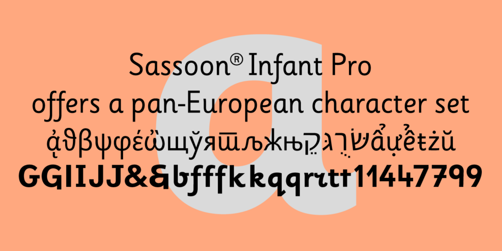
Sassoon Infant Pro is an upright typeface with generous ascenders and descenders, featuring an elevated x-height that makes it easy to read at small sizes. Available in various weights and styles – italics included! – it provides OpenType features such as swashes, titling alternates, and discretionary ligatures that make Sassoon Infant Pro an attractive option.
Bold
Sassoon Infant Font is an elegant, clean-looking font perfect for numerous design projects, including logos, business cards, invitations, magazine or newspaper titles, advertising messages, and website headers. With an elegant yet easy-to-read appearance and compatibility with most textures and contents.
The upright letters feature generous ascenders and descenders, making them suitable for screen use. Their ample ascenders and descenders facilitate word recognition while their exit strokes connect words visually and lead logically toward joined-up handwriting. Teachers can print desk strips, charts of letter families or alphabet friezes for students with diverse needs.
This font is free for personal and noncommercial use only, if you would like to make commercial use of it please reach out to Adrian Williams Design Ltd for license details. All rights are reserved by Adrian Williams Design Ltd in 2019.
Medium
This font stands out with a striking combination of boldness, dark texture, and high control. It has been used extensively across various designs and projects such as logos, posters, advertising, publishing, and pairing with other fonts to form beautiful titles; making it a fantastic modern style font option.
Sassoon Infant font is a favorite choice among schools to teach cursive writing, featuring extended ascenders and descenders that help pupils form letters accurately and has various features to identify letter shapes underlying this upright font.
Sassoon font is available both as regular and bold versions, with schools typically opting for the former which contains all alternative letters within one font, while publishers and designers typically separate these into their font as is standard practice.
Light
Rosemary Sassoon designed this font, and it has become widely utilized across numerous projects. A sans-serif font with bold letterforms and high visual impact, this font also stands out for being easy to read with its smooth surface texture – qualities which have earned its use by designers in several brands and company initiatives.
This font is ideal for educational use, offering students a selection of fonts designed to assist with writing and reading instruction in school settings. These fonts represent handwritten letterforms to aid with phonics instruction as well as handwriting activities – plus you can even download them through Twinkl or other sources!
Sassoon Infant font is free for personal use, though commercial use requires a license. Available both in OTF and TTF formats, it includes bonus swashes, alternate glyphs, and unique ligatures to personalize your text even further.
Regular
This font boasts a bold appearance and dark texture, making it ideal for display projects. Additionally, this font works great for logo designs, book covers, and business cards as well as adding stylish text overlays onto background images.
Sassoon Infant Pro Regular font stands out from similar typefaces with the many additional features that set it apart, including OpenType Swashes- and Titling-Alternates as well as beginning/ending swashes, Cyrillic, Latin support, free download availability, Cyrillic/Latin language compatibility and beginning/ending swashes. Be mindful when using it in commercial projects though – always consult its license first!
Rosemary Sassoon and Adrian Williams collaborated to design this font for school use. It was developed to meet schools’ demands for pupil handwriting and reading materials, featuring upright letters with extended ascenders and descenders for screen reading, helping word recognition. Furthermore, its exit strokes can easily be joined by hand for effortless use with desk strips, charts of family names, or alphabet friezes printed by teachers.


