
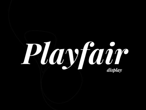
Playfair Display Font
Playfair Display Font is a serif typeface that conveys class and sophistication. It has classic proportions and high contrast between thick and thin strokes.
Its delicate hairlines make it a great choice for logos and headers. It also works well in body text. It pairs well with sans-serif fonts like Lato and Open Sans for balance and readability.
Italics
Playfair Display is a gorgeous serif font that works well in italics. It has a very large x-height and short descenders, making it an excellent choice for headlines and titles. It also has extra short capitals, which can help to achieve a more even typographic color when typesetting proper nouns and initialisms.
High-stroke contrast serif fonts like this one are often used in fashion branding, as they lend a sophisticated editorial voice. They can also be used for logos, especially when italicized. This beautiful serif font is the perfect example of a classy, elegant design. It’s also free for personal and commercial use!
This beautiful serif font has a very vintage feel to it. It would work beautifully in a logo, or as a supplemental font for larger text. It would also look great paired with a handwritten font with a different vibe. This brush script, for example, has a charming, whimsical feel that would complement Playfair Display perfectly. It also comes with alternates and ligatures, so you can create a unique look for your project.
Bold
With its delicate curves and high-contrast strokes, Playfair Display is a gorgeous font for headlines and titles. It is a transitional serif, taking inspiration from designs from the Age of Enlightenment and especially typefaces like Baskerville.
High-stroke contrast serifs are a favorite among fashion and editorial brands, as they add a touch of elegance and sophistication to their branding and logo designs. You can also use Playfair Display to create stylish blog headers and titles or to make your invitations and wedding stationery stand out.
Keep in mind that Playfair Display is a display font, so it works best when used for showy purposes like social media posts or title cards. The thinnest parts of this font will break down at small scales, so be sure to avoid using it for lengthy body text. Also, keep in mind that reading speeds vary greatly from person to person, so it is important to test out different fonts before choosing one for your project. The Nielsen Norman Group did a study on this exact topic and found that the right font can make a big difference in reading speed.
Regular
Designed by Danish designer Claus Eggers Sorensen in 2011, Playfair Display is a beautiful serif font with a modern touch. This transitional design has an extra-large x-height and short descenders that make it perfect for titling and headlines. It can also be set without a prefix, which is ideal for news headlines and other text with many capital letters. Its capital letters are very short and only slightly heavier than the lowercase glyphs, which reduces the contrast between upper and lowercase texts. This makes it a good choice for languages with many capital words, such as German.
Its delicate features create a classic look, and it is also very legible in small sizes. This is a great option for website headers, titles, and hero sections. It also works well in printed materials, including logos, business cards, and invitations.
The high-stroke contrast of this serif font gives it a timeless elegance, making it perfect for fashion brands and magazines. You can use it with other types of fonts to create a unique style. For example, try pairing it with a playful script font like Pacifico or Dancing Script for a more whimsical feel.
Black
In the style of Bodoni and other transitional serif fonts, Playfair Display is a stylish font that can be used in many different design projects. It’s ideal for points of emphasis, like titles and headlines, but can also be used in smaller sizes, like body copy. This makes it a great choice for fashion and editorial branding, and you’ll see that many magazines and lifestyle brands use serif fonts like this in their designs.
Its high-stroke contrast and delicate hairlines make it perfect for editorial design, and its large x-height and short descenders make it easy to read at small sizes. It’s also a good choice for luxury brands or fashion-focused websites, as it conveys a sophisticated editorial voice.
Designed by Claus Eggers Sorensen in 2011, Playfair Display is inspired by classic typefaces from the 18th century. Its open counters and pronounced serifs make it a versatile font that can be used for a variety of creative materials, including logos, headers, and labels. Try it out for your next project and see how it complements your other fonts!
Condensed
Playfair Display is an elegant, high-contrast serif font that looks as beautiful in headlines as it does in body copy. Designed in 2011 by Claus Eggers Sorensen, Playfair Display draws inspiration from Baskerville and, more broadly, typefaces from the Age of Enlightenment. Its notably large x-height, short descenders, and similar optical weight between upper and lower case make it a particularly good choice for titling and headlines.
This style of serif is ideal for fashion and editorial projects because it conveys a sense of elegance and grace. Moreover, it pairs well with other sans-serifs and can be used in longer stretches of text.
According to research conducted by Nielsen Norman Group, the font you use can have a significant impact on how fast your reader reads. Choosing the right font is crucial because our reading speeds vary from one person to another. Playfair Display is perfect for titling because it has extra-large x-height and short descenders, which makes it easier to fit it on the page without much leading. Its capitals are also very short, which helps achieve a more even typographical color when typesetting names and initialisms.
Faqs
Certainly! The Playfair Display font is a typeface designed by Claus Eggers Sørensen. Here are some frequently asked questions (FAQs) about the Playfair Display font:
- Who is the designer of Playfair Display?
- Playfair Display was designed by Danish designer Claus Eggers Sørensen. It is a transitional serif typeface.
- What is the style of Playfair Display?
- Playfair Display is a traditional, elegant, and high-contrast serif font. It falls under the category of transitional typefaces, which means it has characteristics of both old-style and modern serif fonts.
- When was Playfair Display released?
- Playfair Display was released in 2011.
- What are the typical uses for Playfair Display?
- Playfair Display is commonly used for headings, titles, and other display purposes. Its high contrast and elegant design make it suitable for projects that require a touch of sophistication.
- Does Playfair Display have different weights and styles?
- Yes, Playfair Display comes in various weights, including regular, italic, bold, and bold italic. These variations allow for flexibility in design and layout.
More,
- Is Playfair Display a free font?
- Playfair Display is available for free on several font websites, but it’s important to check the licensing terms for your specific use case. Some uses may require a commercial license.
- Can Playfair Display be used for body text?
- While Playfair Display is primarily designed for display purposes, it can be used for short paragraphs or quotes. However, it’s not recommended for extensive body text, as its high contrast and ornate design may affect readability in smaller sizes.
- Are there alternative fonts similar to Playfair Display?
- Yes, there are other fonts with similar characteristics to Playfair Display. Some alternatives include Georgia, Baskerville, and Times New Roman. However, each font has its unique features, so it’s essential to choose the one that best fits your design needs.
- Can I use Playfair Display on my website?
- Yes, you can use Playfair Display on your website. Make sure to check the font licensing for web usage, and you may need to host the font files or use a web font service.
- Is Playfair Display suitable for print and digital design?
- Yes, Playfair Display is suitable for both print and digital design. Its elegant design makes it versatile for various design projects, such as posters, invitations, websites, and more.
Remember to check the specific licensing terms and conditions associated with the use of Playfair Display in your projects.
Compatibility
Playfair Display is a versatile font that is compatible with various platforms and applications. Here are some common scenarios where you can use the Playfair Display font:
- Graphic Design Software:
- Playfair Display is compatible with popular graphic design software like Adobe Photoshop, Illustrator, and InDesign. You can use it for creating posters, brochures, logos, and other design elements.
- Word Processing Software:
- You can use Playfair Display in word processing software such as Microsoft Word or Google Docs. It’s suitable for creating stylish and elegant documents, especially for headings and titles.
- Web Design:
- Playfair Display can be used for web design projects. You can include it in your CSS stylesheets for headings and other display elements. Make sure to use web font services or host the font files to ensure proper rendering on different browsers.
- Presentation Software:
- If you’re creating presentations using software like Microsoft PowerPoint or Google Slides, Playfair Display can be a great choice for titles and headers, adding a touch of sophistication to your slides.
- Printing:
- Playfair Display is compatible with printing applications. Whether you’re designing business cards, invitations, or any printed material, you can use this font to achieve an elegant and professional look.
More,
- Desktop Publishing:
- For desktop publishing projects, such as creating magazines or newsletters using tools like Adobe InDesign, Playfair Display works well for headlines and subheadings.
- Web Development:
- If you’re working on web development projects, you can integrate Playfair Display using web font services like Google Fonts or by hosting the font files on your server.
- Social Media Graphics:
- Playfair Display can enhance the visual appeal of social media graphics. You can use it in applications like Adobe Spark, Canva, or any other design tool you prefer.
- Ebook Design:
- For ebook design, especially for titles and chapter headings, Playfair Display can be an excellent choice. Ensure that your ebook format supports custom fonts.
- Mobile Applications:
- Playfair Display can be used in mobile app design for headings and titles. Ensure that the font is properly licensed for your application, and include the necessary font files if needed.
Always check the licensing terms associated with the use of Playfair Display in specific applications, and ensure that you have the right to use it for your intended purpose.
Conclusion
In conclusion, Playfair Display is an elegant and versatile serif font designed by Claus Eggers Sørensen. It belongs to the transitional serif category, showcasing a balance of classic and modern design elements. Here are the key points to summarize:
- Designer: Claus Eggers Sørensen is the designer of Playfair Display, creating a typeface known for its sophistication and high contrast.
- Style: Playfair Display is a traditional, high-contrast serif font with transitional characteristics, making it suitable for various design applications.
- Release Date: Playfair Display was released in 2011 and has since gained popularity for its aesthetic appeal.
- Usage: It is commonly used for display purposes, such as headings, titles, and other prominent text elements. While it can be used for short paragraphs, it may not be ideal for extensive body text due to its ornate design.
- Weights and Styles: Playfair Display comes in different weights, including regular, italic, bold, and bold italic. This variety allows for flexibility in design.
- Licensing: Playfair Display is available for free on various font websites, but it’s crucial to check the licensing terms for your specific use case. Commercial uses may require a license.
- Compatibility: Playfair Display is compatible with graphic design software, word processing applications, web design, presentations, printing, desktop publishing, web development, social media graphics, ebook design, and mobile applications.
Always check the licensing terms associated with Playfair Display and ensure its compatibility with your intended platform or application. Whether you’re working on print or digital projects, Playfair Display can add a touch of elegance and style to your designs.


