
Linotype Didot Font Review
Didot was drawn by Adrian Frutiger in 1991 and is based on fonts cut by Firmin Didot between 1799 and 1811. It’s the perfect choice for elegant book and magazine designs as well as advertising with a classic touch. So, the latest version of Linotype Didot Font is being provided here to download.
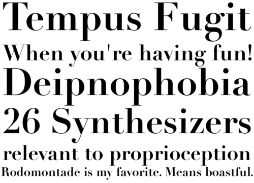
Like Bodoni, Didot belongs to the Didone type classification. It’s an elegant serif font that has a regal aesthetic.
Features
Linotype Didot is a typeface designed by Adrian Frutiger in 1991. It is a modern serif typeface characterized by its high contrast between thick and thin strokes, vertical stress, and elegant, refined appearance. Here are some of the key features of Linotype Didot font:
- High Contrast: Linotype Didot is known for its dramatic contrast between thick and thin strokes, which contributes to its elegance and sophistication.
- Vertical Stress: The vertical stress in Linotype Didot gives it a classical appearance, with vertical lines emphasizing the upright posture of the letterforms.
- Elongated Serifs: The serifs in Linotype Didot are often elongated and thin, adding to the overall gracefulness of the typeface.
- Sharp, Thin Hairlines: The hairline strokes in Linotype Didot are very thin, providing a delicate contrast to the heavier main strokes.
- Large x-Height: Despite its high contrast, Linotype Didot generally has a generous x-height, making it relatively easy to read at smaller sizes compared to some other high-contrast typefaces.
- Regular and Italic Styles: Linotype Didot typically comes in both regular and italic styles, allowing for versatility in design applications.
- Old-style Figures: Linotype Didot often includes old-style figures (also known as lowercase or text figures), which are designed to blend in better with lowercase text.
- Swash Capitals and Ligatures: Some versions of Linotype Didot include swash capitals and ligatures, providing additional options for decorative typography and elegant design compositions.
Overall, Linotype Didot is a classic and elegant typeface that is often used for high-end design projects such as luxury branding, editorial design, and invitations, where a sophisticated and refined look is desired.
Italics
Didot is a gorgeous font that can add elegance to your design. It is considered neoclassical and evokes the Age of Enlightenment. The Didot family owned the most prominent print shop and font foundry in Paris, and Firmin did much of the actual typesetting between 1784 and 1811. He modeled his fonts after Baskerville but did not copy it exactly. His statuesque fonts are known for their increased stress and fine hairline strokes contrasting with bold main strokes. They are also reminiscent of those designed by Giambattista Bodoni around the same time in Italy.
During the transition from hot metal typesetting to phototype and digital versions, a problem developed with these fonts—especially in smaller point sizes. The fine thin lines would disappear in some cases, a problem called dazzle. Designer Adrian Frutiger addressed this issue by designing a version of Didot for Linotype that includes adjustments to the hairline serifs in small point sizes.
Another version of Didot was created for Hoefler & Co. and is a bit different than the one bundled with Mac operating systems. This version anticipates the degradation of the hairlines in smaller point sizes and uses a heavier weighted stroke to help them stand out.
Regular
The Didot family owned one of the most influential printing and font foundries in Paris, at the time. Firmin Didot developed the typefaces between 1784 and 1811. The Didots were printers to the King, with seven members of the family working in various capacities. They also pioneered stereotyping, the process of cutting a solid plate of type metal from a mold rather than a form full of loose types. The stereotypes were lighter and less fragile and allowed books to be printed at a lower cost, opening up book ownership and casual literacy to the masses.
Didot is a classic high-stress, increased-stroke contrast font. It was contemporary to similar faces developed by John Baskerville in England and Giambattista Bodoni in Italy.
Weird Serif is a revival of the super contrasting fancy Didones, as seen in magazines like Vogue or the logotypes of Armani and Elle. It’s designed for display sizes and replaces conformity with expressiveness. You can see this in the idiosyncratic arrow serifs on ‘g’ and ’c’ or the little spikes at the ends of the hairline serifs.
Bold
The bold sophisticated serif that is Didot has been used in the logotypes of Vogue, Elle, and Armani. It exudes luxury and opulence, making it a perfect choice for fashion-related business visual identities.
The Didot family were printers, typefounders, and inventors in the eighteenth century. Firmin Didot patented the stereotyping process, a method of printing text from solid stereotypes instead of the more fragile and time-consuming process of setting up a new form of type each time a page was printed. The stereotypes were lighter and took up less space. Allowing books to be cheaper and opening up book ownership to the masses.
In the nineteenth century, the Didot typefaces were used for book publication including the edition of La Henriade by Voltaire in 1818. The statuesque, clear forms of Didot faces have been compared to the types designed by Giambattista Bodoni around the same time in Italy.
Today, the Didot fonts are available in several revivals for hot metal and digital typesetting. Adrian Frutiger’s Linotype Didot. Which spans two weights with italics and a headline cut for larger sizes, and has a wide character set that includes Greek, Cyrillic, and Coptic.
Light
Didot is a classy font for headlines and logos. It pairs well with script, handwriting, and signature fonts. It’s also a great font to use with floral photography and botanical illustrations.
The Didot family of printers and type designers were active throughout the 18th and 19th centuries. They were inventors, artists, printers, and intellectuals. The Didots developed a series of high-contrast fonts with increased stress that were contemporary to similar faces designed by Giambattista Bodoni in Italy.
While Didot is a great choice for headlines, it’s often too bold and thick to be effective in body text. It’s best used for titles and logos and often paired with a geometric sans-serif font for balance.
For a font that is similar to Didot in style but has more of a modern aesthetic, try RNS Alameda. So, it has thin strokes and more of a curved edge to the serifs. It’s a bit too bold for small text but would look great on a magazine cover or in the title of a book.
Condensed
Didot-style fonts are classy and elegant, making them a popular choice for fashion, packaging, and more. The aesthetic of Didot and other fonts in the Didone genre can be described as “classic with a touch of modern.”
So, the Didot family were printers, publishers, and punch-cutters. And typefounders active in the eighteenth and nineteenth centuries. So, they had their print shop and typefoundry. And Firmin Didot created a series of statuesque fonts between 1784 and 1811. These are in the style known as Modern or Didone. Which was developed in conjunction with similar types by Giambattista Bodoni around the same time in Italy.
Fonts in the Didone style typically have high contrast, with thick lines or strokes paired with thin ones. They also have narrow or hairline serifs. Which gives the font a more refined look.
So, the Didot font has a wide range of uses. But it is particularly suited to titles and headlines. Where its varying stroke thicknesses and widths add visual interest. The font is also highly legible in small sizes and works well on Retina displays.
FAQs
- What is Linotype Didot?
- Linotype Didot is a typeface designed by Adrian Frutiger in 1991. It is a modern serif font known for its high contrast between thick and thin strokes, vertical stress, and elegant appearance.
- Where can I find Linotype Didot?
- Linotype Didot is available for purchase and download from various font retailers and distributors, including the Linotype website, Adobe Fonts, and other online font marketplaces.
- What styles are available in Linotype Didot?
- Linotype Didot typically comes in regular and italic styles. Some variations may include additional weights or styles. Such as bold or condensed, and may also offer swash capitals and ligatures.
- What are the main features of Linotype Didot?
- The main features of Linotype Didot include high contrast between thick and thin strokes, vertical stress, elongated serifs, sharp, thin hairlines, and old-style figures. Some versions may also include swash capitals and ligatures.
- What are the common uses of Linotype Didot?
- Linotype Didot is often used in high-end design projects such as luxury branding, editorial design, book covers, and invitations. And other applications where a sophisticated and elegant look is desired.
- Is Linotype Didot suitable for body text?
- Linotype Didot’s high contrast and elegant appearance make it ideal for headlines, titles, and display purposes. It may not be as suitable for long passages of body text due to its dramatic contrast and thin hairlines. However, it can be used effectively for short paragraphs or captions when used at larger sizes.
- Can I use Linotype Didot for commercial projects?
- Yes, Linotype Didot is a commercial font. So you will typically need to purchase a license to use it in commercial projects. Be sure to check the licensing terms provided by the distributor or font foundry from which you acquired the font.
Conclusion
Linotype Didot is a classic and elegant typeface designed by Adrian Frutiger in 1991. So, its distinctive features include high contrast between thick and thin strokes, vertical stress, elongated serifs, and sharp, thin hairlines. Linotype Didot is commonly used in high-end design projects such as luxury branding, editorial design, and invitations. Where a sophisticated and refined aesthetic is desired.


