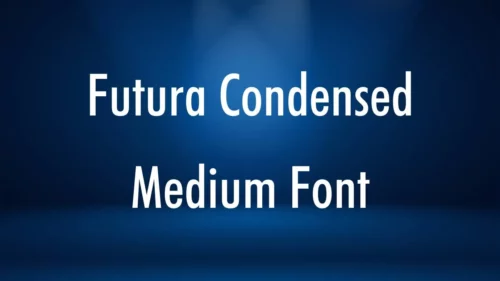
Futura Condensed Medium
Futura is a popular sans-serif font that has become synonymous with modernism. Its appeal stems from its attractive spikiness and clean lines.
Futuristic fonts have been used in numerous logos and advertisements, including those of IKEA, Supreme, Volkswagen, RAI, Crayola, and FremantleMedia. It was also used for the title cards in Channel 4’s Utopia season 2.
Choosing a typeface is an important design decision. You can choose from a variety of alternatives to suit your style and project.
Characteristics
Futura is THE prototype of a geometric or constructed linear sans serif and remains to date the most widely used font of this type. This is not only evident in its wide use for corporate identity (e.g. Volkswagen, IKEA, Vuitton, Coca-Cola, Royal Dutch Shell, etc.) but also in famous film projects by Kubrick and Anderson. It is a very efficient font to use for text because of its legibility at small sizes. It is also often employed for logotypes, especially for its slim variants.
As soon as it was released, Futura became an emblem of modernity and foundries quickly launched other similar geometric sans-serif designs. One such example is Gill Sans which was heavily influenced by Futura and has become a classic of British typography. Gill Sans is a versatile font that can be used in many contexts and provides a great alternative to Futura Condensed Medium.
Other notable alternatives to Futura include Century Gothic which shares the same geometry as Futura but with more humanist touches. Another good choice is Lato which is a geometric sans-serif with open and clean letterforms. It’s a free Google Font and offers a lot of versatility for both web and print design projects.
Weight
Futura Condensed Medium is a condensed version of the original font that has been scaled down and sharpened for more compact text. It is a good choice for headlines or short texts. Its rounded corners and smooth lines make it look elegant. The font is also a good choice for logos and other types of printed documents. It is available in a wide variety of weights and styles. Several other typefaces share a similar look and feel to Futura Condensed Medium. Making it a versatile choice for many different design projects.
Paul Renner began sketching the letters that would become Futura in 1924. His first attempt, called Steile Futura (steil meaning upright or steep) was closer to nineteenth-century sans serifs than the geometric model that he eventually developed into Futura. During the 1930s, he worked on intermediate versions such as the true italic Renner Kursiv and the more conservative Renner Grotesk.
In addition to being a popular font for newspapers and magazines, Futura is used in television and film. The NBC sports team uses a bold variant as its wordmark, and the font is featured in some of the UK television series Utopia and the season two trailer for Stargate Universe. It also appeared on the classic Region 2 DVD covers of Doctor Who novels in the 1980s.
Style
Choosing the right font for a project is a vital step in design. The font you choose can set the tone for your work and influence how others perceive your message. Futura Condensed Medium is a versatile font that can be used in a variety of different designs. With its crisp, clean lines and modern spirit, this font is an excellent choice for a wide range of applications.
Unlike other geometric sans-serif typefaces, which are usually designed for display use, Futura was created for text use. Its clean lines and sturdy proportions make it a great choice for texts of all sizes, from headlines to body text. It is also highly legible in small sizes, which makes it a good choice for printed materials.
Futura has a wide range of uses, from logos to advertisements and even in some vehicles. It is used by many brands, including Supreme, IKEA, Volkswagen, and Citroen. It is also used in the instrument panel graphics of some automobiles, including Mercedes-Benz and BMW. So, it is also used in the NASA Apollo space program for its charts and technical documents.
Several fonts resemble Futura Condensed Medium. One option is Lato, which has a similar geometric style but with open letterforms. Another is Helvetica Neue, which is a versatile sans-serif font that can be used in various types of projects. Both of these fonts are available on the Google Fonts website.
Availability
Futura Condensed Medium is a great choice for print and digital designs that require a geometric sans-serif. The font is incredibly versatile and has been used in many advertisements and logos including those of Volkswagen, NBC Universal, Apple, Supreme, and FremantleMedia. It has also been used extensively in transportation, with Mercedes-Benz and Citroen using the font for their instrument panel graphics and in NASA documents, maps, and spacecraft control panels.
Futuristic shapes are a key feature of the font but it also has characteristics that hark back to classic serifs such as its low x-height and triangular serifs, giving it a clean, sleek appearance while still providing excellent legibility. The font also has a large set of open-type features which allows designers to customize the font to fit their design needs.
Other fonts that share a similar aesthetic to Futura Condensed Medium are Avenir and Century Gothic, both of which have a modern style with clean lines and geometric shapes. However, Avenir is more humanist in its appearance than Futura and includes some subtle, elegant touches that make it suitable for a wide range of uses.
The other alternative to Futura Condensed Medium is Oswald, which was originally a metal typeface but is now a digital digitization by Neufville Digital. The font includes a comprehensive character set that covers most of the world’s languages.


