
Century Schoolbook Font
Designed in 1918-21 by Morris Fuller Benton for Ginn & Co. textbooks, this transitional serif font is heavy and robust but very clear. It has an open appearance and a large x-height that makes it great for text. So, you can easily download the latest version of the Century Schoolbook Font from below.
This font is ideal for lines of text that need to be read carefully. Appellate courts use it for their opinions and endorse it for appellate briefs.
Italics
A well-chosen font that matches the overall style of a text can have a big impact on its appearance in printed form. Factors like paper type, printing method, and continuous ink coverage affect the appearance of the font. Considering these factors, you can ensure that your print materials are of high quality and look great in all types of settings.
Century Schoolbook is a body text face intended for use in books, newspapers, and magazines. Its sturdy design makes it particularly readable compared to other serif fonts. Its legibility is a result of its wide x-height and a balanced ratio between stroke thicknesses. The rounded corners and fine tapers also contribute to its readability.
The family was originally cut by Linn Boyd Benton for master printer Theodore Low De Vinne and was first released by American Type Founders in 1894. Benton’s son Morris later expanded the face into a large family. Its name is derived from its original purpose of being used in The Century magazine.
In the digital age, Century has been digitized by various foundries, including Bitstream and Monotype. The Bitstream version is closer to the original design and was designed by Matthew Carter. Another digitized variant is Old Standard by Alexey Kryukov, which is based on nineteenth-century printing, especially from Russia. Lastly, New Century by David Berlow was designed from 1979 to 1981 in the New York Lettering office of Merganthaler Linotype and is a bit looser in appearance.
Bold Italic
Century Schoolbook is a classic serif font that has become a staple in many design projects. Its legibility and traditional elegance have made it a popular choice for both academic and literary purposes. However, the ever-changing landscape of design often prompts designers to seek out other fonts that either offer a close resemblance or have similar foundational qualities as Century Schoolbook.
Century was designed by Morris Fuller Benton in 1919 for the American Type Founders at the request of Ginn and Co., a textbook publisher seeking an especially easy-to-read face for schoolbooks. It is a transitional face that belongs to the Didone genre, with elements of both a sans-serif and a serif design. The letters have a slightly heavier appearance than most other serif faces and a lower stroke contrast. The capitals feature beautiful bulbs at the ends of their strokes, while the small letters have surprisingly modest descenders and ascenders.
Bold and italic font styles are commonly used in print and online documents to highlight text or draw attention to specific words or phrases. Bold fonts have a darker and thicker appearance, while italic fonts are slanted and cursive in style. Both font styles can be easily created in a document using a toolbar button or keyboard shortcuts. This font can be used in a variety of design projects, including cover and logo designs, shop and store names, or as a stylish text overlay on any background image.
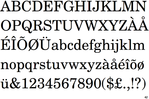
Regular
Designed by Morris Fuller Benton, Century Schoolbook is a serif font that was created to fulfill the need for a solid and legible face used in printing schoolbooks. It is wider and heavier than Century Expanded, with less contrast between thick and thin strokes. Its sturdy nature and inherent legibility have made it a popular choice for books, newspapers, and magazines.
URW++ is a font company that has been in business for more than fifty years, and they’re well known around the world for their high quality and elegant font designs. They offer a wide variety of styles that can be customized for any project or client, and they also provide custom design services to make your brand stand out like never before.
Century Schoolbook is a classic and elegant serif font that was designed by Morris Fuller Benton in 1919. It is a low-contrast text face that was originally designed for use in schoolbooks and children’s books. The Century Schoolbook family includes regular, bold, and italic weights, as well as corresponding Latin and Cyrillic language support. It is a good choice for titling and headlines, and it has been used on many movie posters and television titles. This font is available for free for personal knowledge and use, but commercial licenses must be purchased if you plan to use it for commercial purposes.
Black
As a result, the font is perfect for large sizes and titles. In addition, it can also be used for headlines and other text in a newspaper or magazine. It is a great choice for titling fonts in science fiction books or posters and it has been used on countless movie and television titles.
Its rounded corners make it an elegant and traditional font that is still in use today. Its x-height, ascenders, and descenders are all perfectly rounded and the serifs on Century Schoolbook are subtly curved and delicate. These characteristics create a font that is incredibly legible and beautiful at the same time.
The typeface is part of the “Didone” genre that was popular throughout the nineteenth century. It was designed by Morris Fuller Benton in 1917. It has been digitized by Monotype and is available in three optical sizes. Another digitized version is Old Standard by Alexey Kryukov, which has more finely tapered strokes and ball terminals than Century. Another revival is Nick Shinn’s Scotch Modern, which has sharper Didone serifs and more contrast than Century.
Despite its beauty, there are some disadvantages to using this typeface. One is that it can be difficult to read at smaller sizes. Fortunately, the use of appropriate font sizes and anti-aliasing methods can help to correct this problem. In addition, the font must be used carefully to achieve the best results. In print, ensuring that the paper is of the highest quality and that there is continuous ink coverage will also help to make it easier to read.


