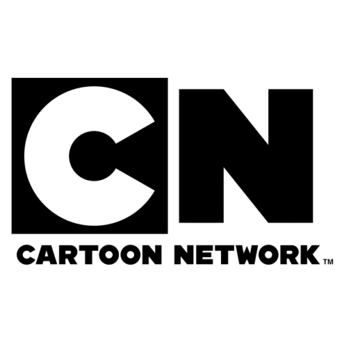
Cartoon Network Font
This image can be used freely with a Creative Commons License; please visit Commons: Licensing for further details. So, you can download the latest version of Cartoon Network Font from below.
Cartoon Network made an unforgettable impression when it unveiled its original logo in 1992 – its iconic black-and-white checkerboard pattern was instantly identifiable and transcended brand recognition to become a universal sign for premium animation entertainment.
The Original Logo
Cartoon Network’s original logo featured an eye-catching black and white checkered pattern designed by Corey McPherson Nash in 1992 that conveyed their commitment to creativity. This horizontally placed rectangle featured squares decorated with thick letters written in sans serif font; white ones featured on black squares while black ones on white ones created an instantaneous visual that became instantly recognizable and associated with high-quality animated content.
Cartoon Network unveiled its initial redesign in 2004. Working in collaboration with Animal Logic Studio of Sydney, Australia to revamp both emblem and wordmark, in-house designers collaborated with Sydney-based agency Animal Logic Studio on revamping previous angled elements and elongated corners that had existed previously; plus they used custom bold sans-serif font CN Bold that was custom created specifically for this logo design.
This logo design was an elegant evolution that honored both the past and future, showing how an effective combination of ideas and designs can forge long-term relationships between consumers and companies.
CN Bold is a bold sans-serif font designed to match the geometric shapes found in the Cartoon Network logo and can be downloaded for free from Font Squirrel for use in achieving that look.
The Redesign
After nearly a decade of success, Cartoon Network took a bold step forward with its design in 2004. Replacing their bright and massive emblem with two overlapping squares with gray shadows gave it a three-dimensional effect; one featured black with white letters “C” imprinted, intertwining effortlessly with white with black letters “N.” Additionally, its wordmark in all capital letters still resided under its emblem as an assurance that even though times had changed this legacy would always remain.
The wordmark was designed with a modern, bold sans-serif font similar to Eagle that conveyed playfulness and creativity that was evident in their animated shows. This striking and stylish aesthetic helped set it apart from the competition while appealing to its target audience of young people who sought unique content that challenged expectations.
Cartoon Network’s current logo was developed in 2010 by its in-house designers and the Animal Logic studio team in Sydney, using a modern geometric sans serif called CN Bold which belongs to them; we believe the closest free font to it would be Cartoon Slam-designed by James Loby.
The New Logo
Animal Logic studio in Sydney, Australia collaborated to design the new logo which featured an eye-catching black and white checkered pattern with each square featuring thick letters written in bold sans serif font – white ones were placed on black squares while black ones on white ones, creating a distinct visual identity for our channel.
Redesign of the iconic Canadian National initials and company name logo with three-dimensional cubes removed to give an entirely flat logo, eliminating elongated corners and other angled elements for a more minimalist appearance. A recognizable black-and-white color palette is also retained.
Cartoon Network’s new logo employs the font CN Bold, a custom variant of Lubalin Graph ITC Turner that draws upon Latin, Greek, and Cyrillic text derived from ITC Avant Garde. This font was developed specifically for its new CHECK it and Dimensional series as well as promotional purposes; moreover its straight lines and blocky font structure distinguish it from previous logo versions.
The Evolution
Cartoon Network now uses a single-box logo to increase brand recognition; previously they used a clear checkerboard with 14 boxes. A variant was seen during Dexter’s Laboratory season one finale with one extra row reading “Studios,” plus Dexter was featured bursting out from it in a different position than the original version and bold sans-serif font called Gotham Black (later changed to CN Bold).
From 1992 until 2004, this version of the logo was widely utilized, typically appearing overlaid onto white backgrounds and featuring a copyright stamp and Turner/Time Warner byline beneath it. Furthermore, its font featured strong lines and elongated corners for a truly contemporary appearance.
Current studio logo usage includes Ed, Edd n Eddy reruns and Incredible Crew DVD releases; as well as other TV shows like Level Up and Tower Prep where an alternate version was used featuring a note double bass theme similar to that found in CHECKit jingles.


