
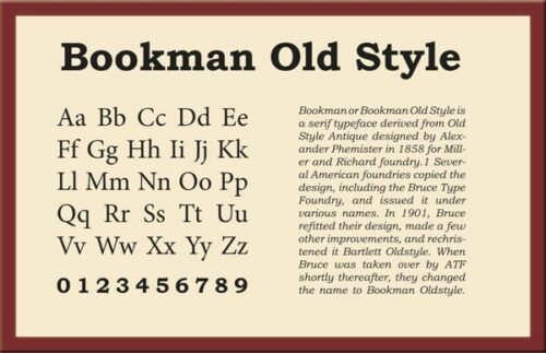
Bookman Old Style Font
Bookman originated from fonts known as Old Style Antique created by Alexander Phemister around 1850 for Miller & Richard foundry. These bolder versions of Caslon were more even and regular with wider lowercase letters and reduced line width variance.
Bookman revivals began to appear for phototypesetting systems during the 1960s and 1970s. These revivals usually featured large repertoires of swash characters arranged tightly.
Characteristics
Bookman Old Style was popular in twentieth-century printing for its solid character and legibility, often used for display typography or advertising purposes due to its bold character and rounded look. While often employed for body text use, its use as an update to Caslon Old Face made this font less frequently used for body text use; nonetheless, it provides a transitional bridge between old styles and modern ones.
Bookman typefaces were inspired by Alexander Phemister’s Oldstyle Antique fonts for Miller and Richard Foundry in 1860. Since then, many American foundries have created their versions and it quickly became a text font of choice. Monotype’s version bundled with Microsoft products features both Roman-based variants of Lanston Monotype and ATF models along with italics inspired by Oldstyle Antique italics from Miller and Richard; its near vertical stress classifies it as transitional.
Ed Benguiat of ITC designed a version of Bookman intended to be more readable than its predecessors in the early 1980s. He created an italic that remains faithful to its style while adding complementary cursive designs reminiscent of Bookman itself and increased x-height as per trend at that time.
Opentype features
Bookman Old Style Font provides a broad character selection, such as ligatures, alternates, and stylistic sets. Stylistic sets aim to harmonize visually or interact in particular ways in certain contexts or settings; in this font, they also feature numerals and other typographic symbols; this font supports Latin, Cyrillic, and Greek.
This typeface evolved from fonts cut by Alexander Phemister in 1858 for the Miller and Richard foundry in Edinburgh Scotland, originally called Old Style Antique. As its name implies, this transitional serif face featured narrower serifs than most body text faces and had high x-height with moderate stroke contrast for optimal legibility – ideal for printing, trade, advertising, and display typography applications.
Phototypesetting technology allowed photo typographers to produce fonts using film and glass photographs instead of bulky metal type. Many fonts created during this era had unique glyph families not possible to produce using metal type, giving each font a distinct look and feel.
In the 1970s, revival fonts with decorative ornate forms saw widespread use during phototypesetting technology and were used by graphic designers to create retro looks. Tight spacing often gave these fonts their signature retro style; others boasted ornate and decorative swash forms.
Contextual alternatives
Bookman Old Style font can add an elegant, decorative element to your designs, while other similar fonts offer similar decorative qualities. Many can be used for titles, headers, and other text elements requiring darker styles while some even can be used to make logos or graphics – the key here is choosing one that complements both your design style and the overall color scheme of your project.
When choosing a font for text, pay close attention to its weights and styles. A transitional serif like Bookman works well with heavier fonts with larger x-heights; however, heavy fonts should not be used in body text or headlines.
Text can also benefit from using a neo-grotesque sans serif such as Helvetica Neue to create a clear hierarchy within designs. You could also try pairing an 18th-century Old-style serif with a Humanist sans serif for increased legibility and readability.
One of the most useful OpenType features for text is contextual alternates (calt). This feature analyzes each character in its environment and compares it with a list of known problematic sequences, then automatically replaces unsuitable glyphs with alternative variants to avoid manually searching for appropriate alternatives.
License
Bookman Old Style Font was designed by Ong Chong Wah as a modern interpretation of an older-style serif dating back to the 19th century and used extensively during the phototypesetting era for many types of text in printed material. Due to its simple but attractive texture and geometric design, Bookman Old Style Font makes a versatile typeface suitable for both formal and casual designs alike – being compatible with both PCs and Mac computers in TrueType format.
Oldstyle Antique is Bookman’s ancestor; an early old-style serif designed by Alexander Phemister in 1858 for Miller & Richard foundry. Similar to Caslon but more uniform in structure with wider and taller lowercase letters as well as more pronounced contrast between line widths and line thickness, Oldstyle Antique makes for an easy-to-read text face that works in large sizes with more gradual italic slopes placing it more in transitional category than old style category.
Monotype’s current Bookman font is based on earlier Lanston Monotype and ATF models, with italics adjusted more closely resembling ITC Bookman. This version boasts an expansive character repertoire supporting Cyrillic, Greek, and extended Latin characters. Furthermore, Microsoft provides commercial versions that come bundled with their products.


