
Bookman Swash Font
The Bookman font family was popular during twentieth-century printing and later revived for phototypesetting systems in the 1960s and 70s, where several versions were created as metal types.
Benguiat’s ITC version differed greatly from the Phemster/Griffith original, yet still contained many classic features. Simonson has gone even further in their version, known as Jukebox Bookman.
Characteristics
Bookman is one of a long line of transitional serif designs that saw widespread usage early on before falling out of favor and eventually finding renewed favor with photo type in the 1960s and 70s, before eventually going back into hibernation again. Mark Simonson recently revived this design through his Bookmania family of Bookman fonts.
This Bookman family draws its inspiration from various versions of ATF’s Old Style Antique font as well as Bookmans cut by Miller & Richard foundry in 1858. Like its Caslon ancestor, this Bookman family features large letterforms with tall lowercase letters but more regular and even letterforms compared to Caslon, making it legible at smaller point sizes than its blocky cousins.
In the late sixties, revivals of Bookman began appearing in phototypesetting systems that decoupled design from metal-type manufacturing processes. This allowed companies to clone existing typefaces and make their versions based on them; many included additional swash characters than what was included with ATF faces originally. VGC of Typositor fame came up with their version known as Sixties Bookman with Swash.
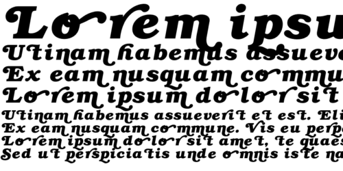
Simonson took great care when selecting which swash options would go into his Bookmania font designs, incorporating only those that provided the greatest visual impact. As a result, Bookmania boasts every modern typographic amenity available: stylistic and contextual alternates, ligatures, italic small caps, and full ornate swash alternates in both Roman and italic styles.
Stylistic Alternates
Bookman Swash Font offers an abundance of styles and options. This font family offers stylistic alternates, ligatures, small caps, decorative ornaments, geometric shapes that add an elegant touch to the text, and decorative ornaments to add more visual interest. Simply use your keyboard to select these features; some programs provide access to this special character or symbol through the Type Tester/Glyph Panel.
Bookman was designed by Alexander Phemister for Miller & Richard foundry in 1858 as an alternative to Caslon-type old-style serifs from the eighteenth century, featuring wider design features and larger lowercase letters than its ancestors. It became widely popular for book printing until it was overshadowed by Monotype Corporation’s more balanced family of book faces in later printing applications.
Ed Benguiat’s ITC version from 1975 remains immensely popular, as do revivals from Linotype and URW foundries. Chauncey H. Griffith from American Linotype Foundry developed one named Bookman while Monotype also produced their own Bookman revival version.
Mark Simonson’s twenty-first-century digital revival, Bookmania, is inspired by older Bookman designs and variants. However, its modern interpretation incorporates every 21st-century typographical feature, such as accented characters, multiple sets of numbers, ligatures, and small and swash caps as well as an ornate selection of swash characters.
Contextual Alternates
Bookman Swash Font features an abundance of contextual alternates, ideal for adding an authentic hand-lettered style to your designs. These include swash capitals, ligatures, and multiple styles of swashed small caps. Furthermore, its generous x-height and moderate stroke contrast help facilitate legibility at smaller sizes.
Mac McGrew notes that ATF’s original metal Bookman old style and italic designs were traditional Roman and italic types without decorative swash letters, similar to what would later become Cushing from BB&S (phototype version shown as Cushing in 1925). Furthermore, their version was less bold.
In the twentieth century, several variants of Bookman were also developed. Variants based on this face included Linotype Bookman with swashed letters; ATF’s Antique Nos. 1 and 2, as well as Sol Hess’ New Bookman for Monotype in 1927 were among those that came close.
Mark Simonson’s digital revival of ITC Bookman in its 21st-century form is a more subdued but still highly decorative typeface. After carefully considering all possible swash designs for his Bookmania re-imagination of this classic family, this highly adaptable typeface makes an excellent choice for creating logotypes, posters, invitations, and designs that require luxurious serif tastes.
Ligatures
Bookman Swash Font has been designed to work effectively across many printed and online contexts, such as logo design, brand identities, posters, packaging, and headlines. Its squarerish proportions and generous x-height provide clarity while its contemporary sans serif features add unique character.
Bookman (commonly referred to as Bookman Old Style) was traditionally employed for display typography and trade printing projects like newspapers and magazines, maintaining legibility at small sizes while being popular for titling due to its more straight-lined serifs. With digital typefaces and OpenType features now available, Bookman Old Style remains popular as a body text font choice.
Revivals of Bookman with swashes were often seen in 1970’s graphic design, and are very closely spaced. Many were designed to match ITC Bookman’s metrics for PostScript compatibility; some even offer additional swash characters or alternates.
Some of the most successful revivals were produced using phototype and dry transfer techniques, including VGC’s Sixties Bookman [as Bookman Bold with Swash] and Bruce Type Foundry’s more refined Bookman, known as Bartlett Old Style with Swash. Phototype versions were offered by Furst (Roman with Italics), Berthold (Roman only), and Formatt [Berthold 1974].
These contemporary revivals of Bookman Italics are inspired by earlier Lanston Monotype and ATF models, but redrawn with near vertical stress and fall characteristics to fit within the transitional category.


