
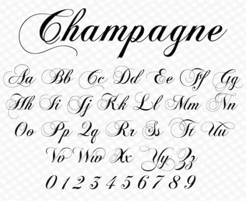
Script Typeface Font
A script typeface, often referred to simply as a script font, is a category of typefaces that mimics the appearance of handwritten or calligraphic text. These fonts are designed to replicate the fluidity and varying strokes found in natural handwriting, providing a more personalized and expressive feel to written content. Script typefaces can be formal or informal, cursive or non-cursive, and they are widely used in various design applications to convey a range of moods and styles.
Here’s an introduction to script typeface fonts:
- Mimicking Handwriting:
- Script typefaces are crafted to imitate the look of handwriting, whether it be elegant calligraphy, casual cursive, or a more whimsical hand-drawn style. The goal is to create a font that resembles the dynamic and unique qualities of written text.
- Varied Styles:
- Script fonts come in a diverse range of styles, from classic and traditional to modern and playful. Some scripts emulate formal calligraphy, while others capture the spontaneous strokes of brush lettering.
- Cursive and Non-Cursive Variants:
- While many script typefaces feature connected letters, creating a cursive appearance, some scripts have distinct letterforms without continuous connections. This allows for flexibility in choosing a script font that suits the specific design requirements.
- Use in Design:
- Script typefaces are widely used in graphic design, branding, invitations, packaging, advertising, and other creative projects. They add a human touch, warmth, and a sense of personality to the text.
- Versatility:
- Script fonts are versatile and can be adapted for various purposes. They work well for headlines, logos, wedding invitations, greeting cards, and any context where a more personal and expressive style is desired.
More
- Formal and Informal Options:
- Formal script typefaces may be chosen for elegant and sophisticated designs, such as wedding invitations or formal event branding. Informal scripts, on the other hand, are more casual and can be used for a laid-back or playful atmosphere.
- Legibility Considerations:
- While script fonts are known for their decorative nature, maintaining legibility is crucial. Designers need to balance aesthetic appeal with readability, especially in longer passages of text.
- Digital and Print Usage:
- Script typefaces are suitable for both digital and print media. They can be implemented in websites, social media graphics, print materials, and other visual communication platforms.
- OpenType Features:
- Many modern script typefaces come with OpenType features such as ligatures, swashes, and alternate characters. These features allow designers to enhance the visual appeal and customize the appearance of the text.
- Popular Script Fonts:
- Some well-known examples of script typefaces include “Lobster,” “Brush Script,” “Bickham Script Pro,” “Great Vibes,” and “Pacifico,” among others.
Script typefaces contribute to the visual richness and diversity of design, offering a broad range of choices for designers seeking to convey specific emotions, themes, or brand personalities through typography.
Script Typeface Font
So, the Script typefaces are a beautiful way to add a touch of elegance to your designs. Their origins date back to the 1700s and include classic penmanship styles with flowing lines and flourishes.
They can give your design a personalized, handcrafted feel and add a sense of warmth and personality. However, it’s important to keep in mind that these fonts have low readability in smaller sizes or with longer texts due to their connected letterforms and elaborate flourishes.
Script typefaces are a great way to add personality to your design
Script fonts are beautiful in their own right, but they can also be challenging to work with. Their delicate lines and minute details often cause illegibility problems, especially at smaller sizes and on screens. To make them more readable, you can increase the size of the font and play around with the kerning. This will help the letters flow smoothly and make them easier to read.
Choosing the right typeface is important because fonts convey feelings and messages. A good script font can set the mood of a design and create a lasting impression on the audience. This is especially true for editorial design, where script fonts can add a sense of elegance and style to the text.
While some designers like to experiment with contrasting fonts, less is more with script fonts. It is best to use them sparingly and only for headlines or titles. This will allow you to highlight the most important elements in your design and avoid a cluttered look. If you need to pair a script with another font, try to choose a font with similar letterforms and strokes to ensure consistency.
Despite their unique personality, script fonts are versatile enough to be used for many different types of designs. For example, they can be used for stylish wedding invitations or romantic greeting cards. They can even be paired with more grungy or casual fonts to create a fun, eclectic aesthetic.
They are easy to read
Script fonts are beautiful but can be difficult to read. They often have swashes, connectors, alternate characters, and casual handwriting styles that add personality to your design but can make them difficult to scan at larger sizes. For this reason, you should use them sparingly and for headlines or short phrases. They are also not good for paragraph text because they lack the clarity of serif fonts. For best results, you should also avoid over-kerning and letterspacing because this can result in unnatural spaces that are hard to read.
Depending on your needs, you may need to choose a font with a lower x-height or one that has a consistent line weight. This will help you keep the ligatures and other design elements of the font while maintaining readability. You can also try to find a font with less stroke contrast, which will be easier to read in smaller sizes.
Whether you are designing a wedding invitation or an eye-catching headline, scripts are a great way to add a little bit of flair to your design. However, they should not be used for formal documents or long blocks of text because they can be difficult to read. Moreover, they can take away from the overall message of your document. Instead, you should choose a font that matches the style of your document and can convey a specific message.
They are versatile
Script fonts are versatile and can add a touch of elegance and style to any design. They can be used for invitations, greeting cards, and even personal branding. They also have a variety of stylistic elements, such as swashes and ligatures. Swashes are decorative flourishes that can be added to the beginning or end of glyphs, while ligatures are unique character combinations that replace individual letters for better flow. These features make it easier for designers to customize and adapt their fonts.
Choosing the right font for your project can be challenging, but with a few helpful tips, you can easily find a script typeface that suits your needs. First, it is important to consider the sizing of your text. Script fonts are generally more readable in larger sizes. They can be a bit more difficult to read at smaller sizes, due to the way their characters interweave and overlap each other. This can be overcome by paying attention to kerning and spacing.
Scripts are also great for adding visual contrast to your composition, but they should be paired with other font styles to avoid overwhelming the design. Using a serif font for headlines or important words and a sans-serif font for supporting text and body content will help you create a clear hierarchy in your design.
They are easy to customize
Script fonts are designed to mimic handwritten or calligraphic styles and have a fluid and organic appearance. They are perfect for highlighting important words or titles in your design. However, they should not be used for body text. Instead, choose a more readable font for your main text. This will help your audience read and understand the message you want to convey.
To pair your fonts effectively, you should look for a balance between them. A good way to achieve this is by using a serif or sans-serif font that contrasts with the script. This will ensure that your paired fonts are legible and easy to read, especially in smaller sizes. Additionally, make sure that your paired fonts are complementary in style and weight.
If you’re working on a multiscript project, it can be challenging to create a functional yet attractive typographic palette. For example, pairing Latin with Arabic or Devanagari can be challenging, as these languages differ significantly in both their visual style and glyph set.
Adding a touch of personality to your designs with decorative fonts can be a great way to grab your audience’s attention. It’s important to test your fonts at various sizes and on different devices, as well as consider any other elements that may affect their legibility. It’s also a good idea to choose a font that is available in both upper and lower case, as this will be more versatile.
Features
Script typeface fonts exhibit several distinctive features that contribute to their unique and expressive appearance. While the specific characteristics can vary among different script fonts, here are some common features associated with this category:
- Handwritten Aesthetic:
- Script fonts are designed to emulate the look of handwriting, providing a personalized and human touch to the text. This often includes variations in stroke thickness and informal letter shapes.
- Variety of Styles:
- Script fonts come in a wide range of styles, from formal and elegant scripts suitable for sophisticated designs to casual and playful scripts that convey a more relaxed and friendly tone.
- Cursive Letterforms:
- Many script typefaces feature cursive letterforms, where letters are connected in a flowing manner. This continuous stroke helps create a natural and harmonious appearance.
- Swashes and Flourishes:
- Swashes and flourishes are decorative extensions or embellishments added to certain letters or the ends of words. These elements enhance the ornamental quality of script fonts and contribute to their artistic appeal.
- Ligatures:
- Ligatures are special characters that combine two or more letters into a single, visually unified glyph. Script fonts often include ligatures to improve the flow and aesthetics of specific letter combinations.
- Contextual Alternates:
- Contextual alternates are alternate glyph forms that are automatically substituted based on the context of the surrounding characters. This feature helps avoid awkward collisions between certain letter combinations.
Other Features
- OpenType Features:
- Many script typefaces are available in OpenType format, allowing for advanced typographic features. This can include ligatures, swashes, stylistic alternates, and more, providing designers with additional options for customization.
- Variable Stroke Thickness:
- Script fonts often mimic the varied thicknesses of hand-drawn strokes. This adds a dynamic and organic quality to the letterforms, creating a more natural and visually interesting appearance.
- Versatility in Usage:
- Script fonts are versatile and can be used for various design applications, such as branding, invitations, headlines, and decorative elements. Their adaptability makes them suitable for a wide range of creative projects.
- Legibility Considerations:
- Balancing ornamental features with legibility is essential in script fonts. While they are known for their decorative nature, ensuring that the text remains readable, especially in longer passages, is crucial for effective communication.
- Emotional and Expressive:
- Script fonts often evoke a sense of emotion and expressiveness, allowing designers to convey specific moods or themes in their designs. The choice of script font can significantly impact the overall tone of the visual message.
- Casual and Formal Options:
- Script fonts come in both casual and formal variations, catering to a diverse range of design needs. Casual scripts may be used for friendly and approachable designs, while formal scripts can add elegance and sophistication.
When selecting a script font for a particular design project, it’s essential to consider the intended mood, audience, and context to ensure that the font aligns with the overall design goals.
Conclusion
script typeface fonts bring a distinctive and expressive quality to design projects, mimicking the charm and individuality of handwritten text. With features such as cursive letterforms, swashes, ligatures, and variable stroke thickness, script fonts offer a versatile range of styles, suitable for a wide array of creative applications.
These fonts strike a balance between formality and informality, catering to diverse design needs, from elegant and formal occasions to casual and playful contexts. Their handwritten aesthetic adds a personal touch to the text, creating a connection with the audience and conveying specific emotions or themes.
The availability of OpenType features further enhances the customization options, allowing designers to fine-tune the appearance of script fonts to match the desired visual tone. Whether used in branding, invitations, headlines, or decorative elements, script fonts contribute to the overall aesthetic richness of design projects.
As designers explore the vast array of script typefaces available, consideration of legibility remains crucial, especially when using these fonts in longer passages of text. Additionally, the emotional and expressive nature of script fonts makes them powerful tools for effectively communicating messages in a visually compelling manner.
In the world of typography, script typefaces continue to be a popular choice for those seeking to infuse their designs with a touch of personality, warmth, and artistic flair. The diversity within the category allows designers to choose script fonts that resonate with the specific nuances of their projects, contributing to the overall visual storytelling and impact.


